

More Color Please
In a world of minimalism, modern crisp white, or even grey – we need to take a break to look at a few colors. Colors that we dream about incorporating into our own graphic designs, crafts, and paintings.
Below are a few inspiring masterpieces and the colors that sparked my interest today:
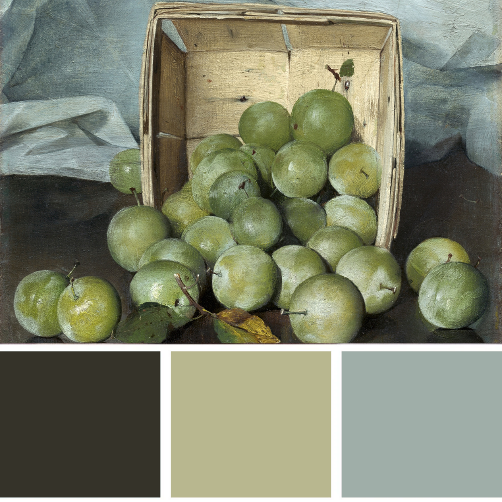
The crisp and grounding hues of shaded greens in these green fruits.
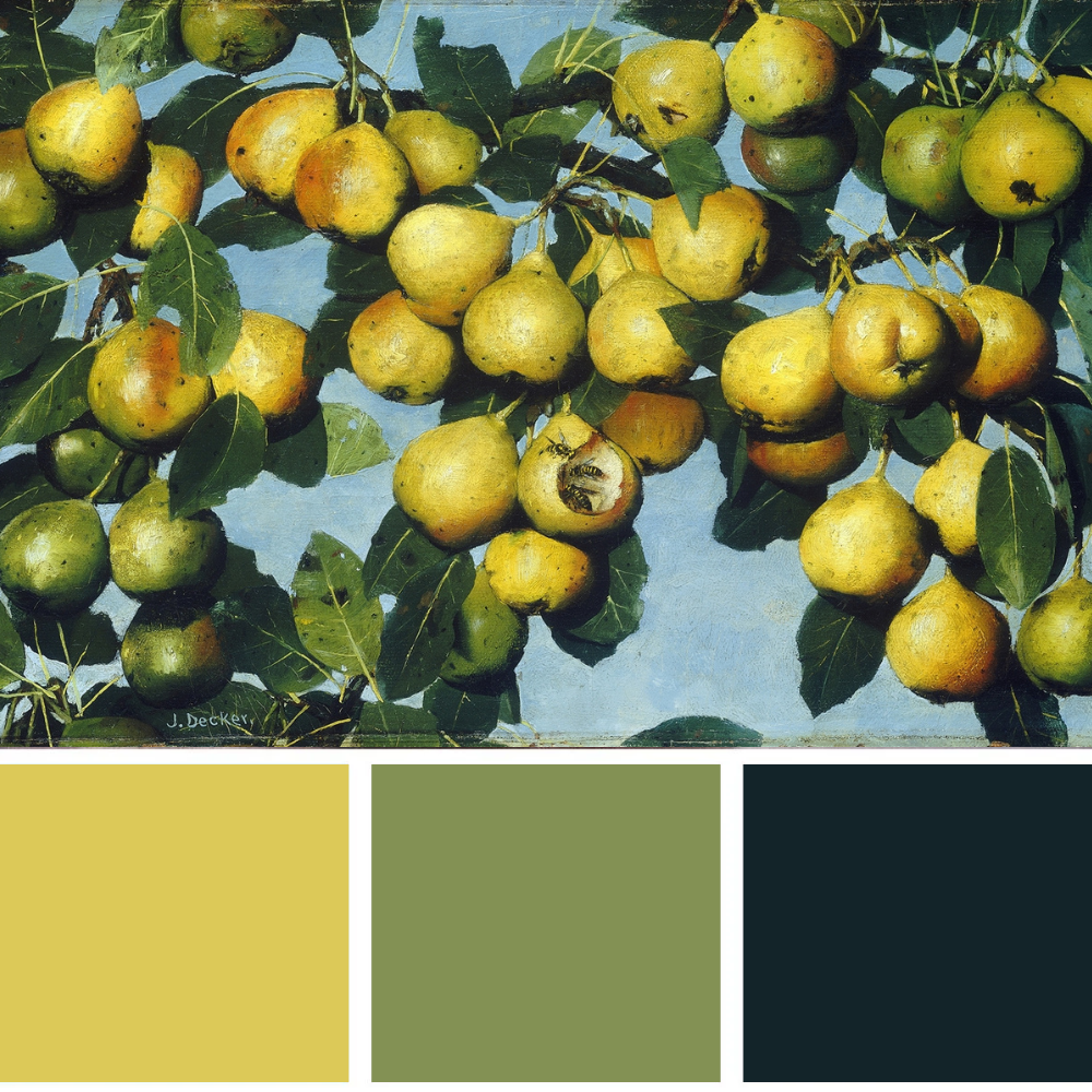
The warmth of a summer afternoon reflected in this palette found in the painting Ripening Pears (c. 1884-1885); by Joseph Decker (American, 1853-1924)
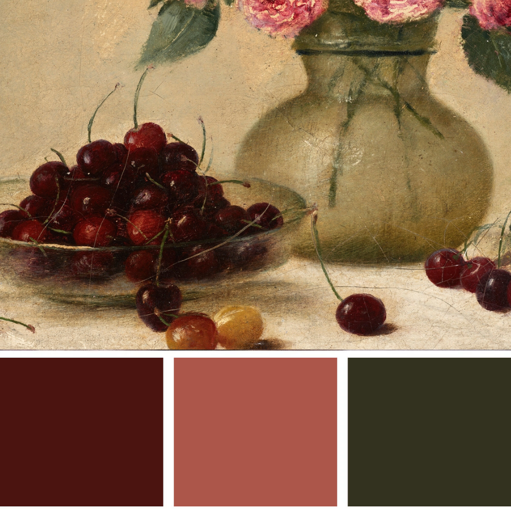
A palette from Bowl of Cherries (1893), by Joseph Decker (American, 1853-1924) creates a sophisticated and warm tanginess.
All of these colors radiate warmth and convey a subtle sense of sophistication. The natural tones gently harmonize, allowing each piece to feel particularly welcoming and instantly inviting.
Balanced with carefully varied lights and darks, they add the needed contrast and nuance to hold your attention and keep you intrigued. For every dark color there is a coordinating light color that creates balance. Just like in real life, we see all shades and harmonies of lights and darks.
My eyes beg for color as I am getting older. Each shade prettier than the last. Color is like water for the eyes and it really makes a huge impact on us psychologically and how we feel.
The luscious bing cherries in deep maroon are my favorite.They are complemented by the pink roses and the natural colors of the entire painting are very comforting.
I really just want to go eat some cherries, right now.