

The Poetry of a Spotted Horse
There is something timeless about a horse rendered in warm earth tones — especially one like this.
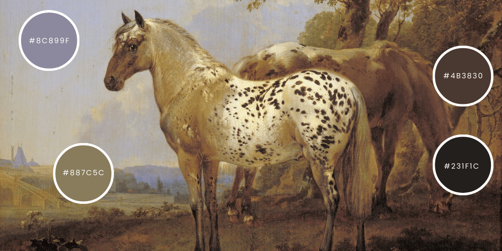
“Leopard” (1761) by George Stubbs
About the Work
Date: 1761
Medium: Oil on canvas
Common Alternate Title: Sometimes simply referred to as A Leopard or The Leopard
Subject: A spotted horse standing in a classical landscape
Despite the title “Leopard,” obviously, the horse is not a leopard — the name refers to the striking spotted coat pattern, which in the 18th century was often described that way.
Stubbs was the most important British equine painter of the 18th century. He studied horse anatomy obsessively — even dissecting horses to understand their musculature.
The horse is more than likely an Appaloosa-type horse with a leopard spotting pattern layered over a golden or buckskin-toned base coat.
And the colors are doing something incredibly sophisticated.
What Breed or Color Is This?
That spotted pattern is characteristic of the Appaloosa coat pattern, which can appear over many base colors — including warm tan, cream, and buckskin tones like this.
The Color Story in This Painting
Let’s look at the first palette from above— even though it is a quiet palette it still creates an interesting environment for the observer. My favorite samples from this painting are:
#8C899F — a dusty lavender-grey sky
#4B3830 — deep saddle brown
#231F1C — rich ink brown, almost black
#887C5C — warm weathered stone / golden taupe
These colors ground the horse in a classical landscape. The creamy golden coat of the horse sits almost perfectly between warm ochre and muted parchment tones. It harmonizes with the background trees and earth without overpowering the scene.
This is not a flashy horse. This is a quiet, aristocratic horse. The dark spotting adds rhythm to the painting — like ink droplets across handmade paper.
Why do these colors matter?
They matter because they reflect true intentions; they reflect not only a moment in time but a true color story of that moment. The colors are chosen by the artist on purpose to convey exactly what they in that moment were feeling. The artists’ color story is their brand, their undeniable style is seen throughout their body of work.
How to use pre-selected color palettes
Take the colors and make them part of your own palette. Any shades we introduce reflect our color story, and we invite you to adapt and refine them to suit your work. This is essential for artists, crafters, and designers who want to develop a unique style for their work and home while maintaining creative autonomy. So have fun, and experiment.
The right artist for the right product
It’s the same reason two different artists can design the same thing and achieve different results. Each designer develops a distinct style and color palette they naturally gravitate toward, and those preferences shape the final outcome. Some designers do especially well in certain genres and less well in others—this all comes down to style.
Designers who work primarily for digital platforms or for newsprint bring different aesthetics to their work. Each person’s background influences how they approach design, and those differences show in the final product. Occasionally, you’ll find designers who can successfully produce work for multiple industries and media—but they are rare. It takes diverse experience and the opportunity to “wear multiple hats” to take an idea from creative spark to a successful finished product.